Freya's Design Blog

Tuesday, November 07, 2006

Finished Illustrator picture

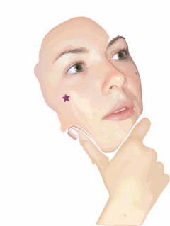
Well, i persevered (sp?) with the Illustrator face, and I finished! And am very proud of how she looks. We presented to the class yesterday, and I'd definitely put more time into mine than anyone else had - most people just used the vector stuff they had used for their Flash projects! I saw Jo's comments on her check sheet, she had written next to everyone's names what peice they had done, ie. a small description etc, and mine said "sisters face - OUTSTANDING!" ;P that's ALWAYS cool to hear! It makes me happy! :D

The only real complaint I have is the hair, it is so hard to do hair, so I made it a lot darker than it really is to disguise it a bit. But apart from that I am very happy overall, I love the eyes, the nose, the ear and the hand! Have I achieved what I set outr to? I'd say a definite yes for this one, she looks as photo-realistic as I could get her. It was about 100 times longer to do that my photoshop drawings but because of the time and energy spent on it, it is very rewarding to see the finished peice! It's definitely something that I may do more of in the future, it produces a very different feel in the way it looks.

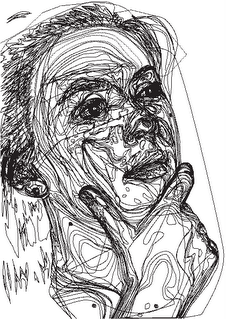
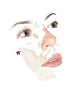
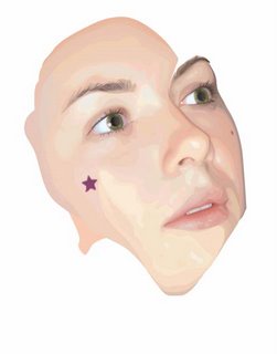
Here is some more "so far" shots of it, the finished thing and all the outlines to show how many shapes were used so one can truly appreciate how long it took me to draw them all (gawd, to draw them all AND colour match them all by eye o_O ).


kendellesofar.jpg

kendellesofar2.jpg


kendelle_vector.jpg


kendelle_vector_outline.jpg

Feedback for lamb - some of the comments and how I changed it.

Good responses from the presentation session - it really is a great system, we get enough time to develop the projects to a good enough level for everyone to see what youare trying to achieve, and yet being always done a week before the deadline means there's enough time to respond to the feedback. Which i did. Here are some of the comments I got;

"it's crap .. you shoudl start again."
>_> ... Thanks Awee!

"text doesn't need to flash different colours [re. the multi coloured text]"...

"it distracts from the rest of the scene."...

"too much going on."...

"hard to read at times."

These were all regarding the multi-coloured text I had, I didnt really like it myself so this feedback was good to get, knowing that it wasn't just me. I was happy enough to get rid of it and just have the text change colour on rollover.


"every so often you could have flocks of sheep running across the screen."

"possibly a small animation in the hills maybe."

I liked this idea, I did a flock of sheep running in the hills, they just come across every now and then in the background. But they looked funny, they just didnt blend with the distance enough, Steve saw them and thought they were a group of bees - so they looked moe like they were flying in the foreground thsn hsving any part of the background. But coz he thought they were bees, I decided that bees would be nice to have instead. Thanks Steve! :D I was originally thinking of having soemthing flying, but all I could think of was birds and I didnt want to animate the birds. Bees is nice though. Now I just have one bee that flies across the screen every now and then, and when I showed mum my project she especially remarked that she like "the bee!" here you can see the bee on the right, and a pink flower that is larger than the others because I was hovering over it at te time!

the_bee.jpg


"cloud speed ... shadows?"

Dave suggested cloud speed, maybe having the smaller clouds going faster than the bigger ones, which I thought was a nice idea, so i did it as two seperate movie clips and I think it looks real nice - props to David. This particular comment was Steve's agreeing with the clouds and suggesting shadows for my foreground characters. I have put shadows in, they dont look especially awesoem but I guess they do add to the overall feel of movement.

shadows_clouds.jpg


"certain colours for each chapter."

This was Mat's idea and I instantly liked it, it was a great solution for the multi-coloured text thing. So each of the four chapters has a colour theme that involves all the text and the navigational arrows. It was a good idea and I like the way it looks, it helps to unify each chapter. In the above picture u can see the rigth nav button is blue and the rest is orange because orange is the theme colour for chapter 3 and blue is it's hover.


These are some of the positive comments which one is alwasy happy to hear:

"quiz is a very good idea."

"nice solution."

"love the idea ... of the lamb jumping over each word with the song."

Am glad people liked the quiz idea, I just thought it would make the whole thing more interactive and interesting, it helps get the kids involved aswell as helping to learn the lyrics of the song as that is what all the quizes are based on.Obviously I loved my lamb jumping on the words idea too. I have put the music in and matched up the notes to the words - it looks REALLY COOL! :D Definitely a highlight for me!

So did I achieve what I wanted to for this project. I would have to say yes for the most part. I did achieve the whole lamb jumping on words thing I envisioned, and it looked exactly as I planned which was nice. I also achieved the quiz section of it which pleases me. I have added a lamb head in the corner of each quiz and he shakes/or nods his head depending on what answer you give.
He is shaking his head in this pic co the sheep isnt pink!

quiz1.jpg

However, i had also envisioned a bit more animation regarding Mary and the lamb, such as PROPER walking into frame, and also more rollover efefects on them too. That I didnt achieve, because I knew it would involve a lot more time (sorry, have to use the 'T' word here) and effort, which i just didnt have, especially because I was pouring a lot of time and energy into the Illustrator face.
So I finished, it isnt exactly what I envisioned but I am still proud of myself for achieveing what I have. I am liking the ability to do interactive stuff like this, and I know that I definitely want to make and interactive portfolio in flash using the techniques I have learnt. And maybe some other interactive cartoon dabbling in the future - I should set myself a goal to make a character actually walk properly into frame! Maybe I will!

DevArt comments left

Some feedback left by me on devart. Most of my comments are usually just stuff like "wow, that's awesome, smiley face heart" etc etc, but if I feel the urge to elaborate and point out the good pionts specifically then I will, and the person who owns the piece usually responds back in a positive way - helping to grow the sense of community. I dont do a huge amount of constructibve criticims as if I instantly dont liks omething based on the thumbnail, I will just pass it by and not bother to comment. But I will point out very small things that could be fixed on pieces that I like very much, but there are rarely any problems to fix as I am only attracted to really awesome artists to begin with!Here are a couple of links to pics I have left comments on (they are Em's)

http://www.deviantart.com/deviation/42598284/
http://www.deviantart.com/deviation/42470046/ (bottom page1)
http://www.deviantart.com/deviation/38230153/?offset=50 (bottom page 3)

I do get little comments on my own pieces about where I can improve a picture, but it is always something I have noticed in the picture myself already. I have responded to comments regarding my Flash thing though.

Saturday, October 28, 2006

Yay for 3d programs!

Not only is devArt an awesome source of inspiration forcool vector work, photoshop work in the realms of my own work - you should see THIS girls stuff! OMG, she is my queen of Photoshop!!


Snow_wolf__by_heise.jpg


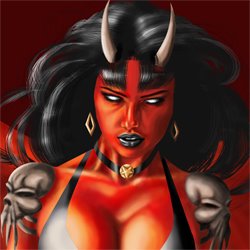
But I am also having so much fun being in the world of 3d pinups! I have "acquired" a copy of Poser 6, a program that multiple people have talked about, and I plan to start dabbling in this area once the holidays come. Check out some of these cool works!


Black_Pearl_by_RainfeatherPearl.jpg


Georgina_and_Jezebel_by_RainfeatherPearl.jpg


The_Dark_Elf_by_RainfeatherPearl.jpg


whisper_on_my_lips_by_tralfaz.jpg

General Illustrator Design

I would like to take this opportunity to display all the design that has been done in illustrator that I like, and would like to be reproducing in the futute.

Firstly, since I came across the NIGHTWISH (OMG NIGHTWISH!!) tour poster that Joe Whyte drew, it was love at first sight. His style is very bitchin' :D His own personal drawing style is exciting and actually quite varied, and then the way he technically executes it is brilliant. He says on his site "My goal is to continually develop my illustration and push it in new directions. I produce work in a range of mediums, from traditional charcoal drawings right through to entirely digital vector illustrations. "
Here is his website http://www.joewhyte.com.au/welcome.html (I highly recommend him to EVERYONE) and here are some of his great peices. He does a lot of music posters and things like cd covers and tshirts etc. I admire his work very much.


a12836.jpg

bce_covers.jpg


headphones.jpg


velvet_rev.jpg


I also want to point out the style of a french artist Arthur de Pins, here is his site http://www.arthurdepins.com/, he has an awesome style, and he dabbles in creating animations out of his vectors too! here is a screenshot of some of the thumbnails on his page.

depinsthumbs.jpg


These vector images are more generic "pretty" designs that I am very attracted to. I like the use of black with a lot of them,a nd the ones with figures I especially like the usage of negative space to produce the image. I would like to be able to do more design stuff like this. I compare it to Huw's work actually, i really admire his pretty style.

Vector Faces

As I mentioned, DeviantArt has realy inspired me to pursue realistic vector faces - not just for Jo, it is somehting I would like to pursue into the futute aswell. I want to put up some of the great vector work i have been collecting, you can see for yourself how inspirational it is:


Fade_to_Black_by_LDYdeath.jpg


Solitude_by_akirichan.jpg


Wages_of_Sin_by_akirichan.jpg


I tried my own hand quickly at an Adriana Lima picture, using the posterising and tracing technique and you can see how well it turned out. here is the vector and the outline to show all the different shapes used.


adriana_vector.jpg


adriana_outline.jpg


For the major illustartor piece however I chose this photo of my sister Kendelle to vectorise.

kendelle.jpg


It has proved much harder as the colours' shapes are not so defined, plus I can't eyedrop the colours. The nose, eyes and mouth look great, I am SO HAPPY with how they turned out and it has really helped me to stay keen on this project because I can see hopeful results for the finished piece. I am starting on the cheek now and having colour diffuculties. This is the vector work i have done so far, and the next picture is the photo of Kendelle with my vector work over the top - you can see the colour problem in the cheek.

kendellevector_sofar.jpg

kendelleandvector.jpg

And now for some piccies - Flash

Going back over the sheet regarding this competency, I have noticed lots of mentions about the Online Media lab. I must go and make comments on the works uploaded there. It was a good experience, it is pretty cool to be working online with other people in real time (even if tones of voice cannot be considered and sometimes mistaken on the written comments.) I must link here to our wiki page. http://medialab.wikispaces.com/Team+B Our challenge was the online documentary. I came up with the two evolved mockups, which was good coz we really needed a visual basis from which to work off. Then I also simplified our concept down into the bottom two navigational sitemaps.

On the thought of comments, I am a very active comment-er on deviantARt, I have received 101 comments from others about my work, and have made 407 on other people's. It serves a couple of purposes. It provides interactivity with artists around the world, it promotes a sense of networking, it is an avenue to express your thoughts on other people's work, and it also serves to get your name and avatar out there on as many pages as you can so other people will be able to look at it and hopefully click on it and come and visit your site, and then make comments about your own work. It is certainly a way of comparing your work to others, and each picture you put up you wirte your artists comments on it and reply to other people's comments on your own work. Would this be suitable for CUVDSP02A/04 ?


Anyway, i wanted to post some pictures regarding how my Flash project was coming along. there are the two original drawings invovling how Mary and the Lamb might look, and some concepts about the interactivity and content.

interactivity.jpg


mary_sketch.jpg


So the basic idea was to have a Mary, and a Lamb. there will be an intro/title page that you click on to enter. then you go to play verse 1. As I drew, I always wanted to have the lyrics there, and the word would light up as the tiny sheep bounced on it, karaoke style. I have acheived this, but I really need to put music in (the whole thing needs more music, or rather, sound effects. children are very easily stimulated both visually and audibly.) i think the addition of music will be easy enough, we will have to see. There will then be quiz type questions (very easy ones) such as what colour was the fleece and how big was the lamb etc. I think i should have 'wrong' and 'correct' sound effects on them too.

Here is some pics form Flash. This is the intro page. I origianally had the title as a dark blue and when u hovered over a letter it would become a different colour. But I changed that to now every letter is a different colour, and they still change to another colour when you hover over (and they glow too when you hover over them - thanks to Matt ;p) Thhen I had the idea of the letters constantly changing to different colours on their own (and still changing again and glowing when hovering). But I don't yet know if that would just be TOO MUCH colour changing? I asked a couple fo classmates and they thought it was Ok ... will see what everyone thinks on Tuesday. The lamb opens his little mough when you hover over him (I will try and insert a "baaa" noise there - oh, he also glows too) and he wiggles his ears and moves his head - it's VERY CUTE! he is the active button to go to the next page.

lamb_intro.jpg


Page 1 here and Mary and the lamb come waddling on from each side. Hopefully I will get them to do things when you hover over them, i havent yet tho. I tried to animate the lamb walking, and it was just HIDEOUS. I realise I should have persisted, but I have enough to do on this thing without spending hours on the walking - and besides, the little kids wont care anyway. They do move into frame,. they rock back and forth, it's kina amusing actually! the text "Play the first verse" is all different colours and those colours move along the letters consecutively. I don't know if that is also too much. i don't know if I really like it. Anyway, you click on that to go to the first verse. Navigational buttons down the bottom (WITHOUT any bevels) take you back to the intro page on on to the first quiz.

lamb_p1.jpg


Here is the lyrics for the first verse, the little lamb bounces in time and the letters light up. It looks pretty cool in action :D
My only qualm is that the page looks really bare. Maybe I should make the words bigger. I did have a dancing sheep under the words but he took the attention away from the bouncing sheep.

lamb_v1.jpg


The quiz is very basic, you click on what you think the answer is and it comes up with "yes" or "no". And as I said, i would like to put in sound effects there.

lamb_q1.jpg


Well, that is as far as I have gotten. I do need to map out the rest of it exactly. I am happy with it so far and I'm also not. I feel it is still rather plain. Maybe i should have those little flowers on the ground grow bigger when you hover over them, maybe I should add a tree with a bird that is also interactive. I have the clouds moving constantly in the background so that there is always something moving.

Friday, October 27, 2006

To Develop Self as Designer

Dear Robin, please excuse me for there will be a long speil of text here, I promise there will be pictures later, I just want to get all the words off my chest first ;)

I find it possibly coincidental that my skill as a DESIGNER is coming to my attention at the same time as this competeny. Lately, especially as we are nearly through for the year, I have had chance to refelct on my work so far and to be very honest with myself, I have not improved as I ought to in my strengths as a designer. Watching, especially, two of my favourite peers Aaron and Emily develop their own talnets to a very impressive degree has been not only inspirational, but also a real reality check for my own work. I can't help but note that it is something similar in their work = ILLUSTRATOR. It is their improvement with the vectors that produces such impressive work from them both. I wanna do more impressive vector work! :0

For our major vector peice, Jo wants us to do something impressive, she showed us the trumpet that looked like a photo and, of course, I immediately wanted to do a face. Since joining DeviantArt (go visit!: http://freyals.deviantart.com) I have been completely addicted to trawling the site for awesome work, I get very inspired from seeing other peoples stuff, and I have seen some AMAZING vector faces that has been incredibly inspiratrionmal in my quest to do a realistic vector face (I know Robin, who would have thought ;p ) So this is something else I really want to acheive.

I also want to realise my vision for my Flash project.

I think at this point I will outline my learning plan:

Learning Plan

What are you going to learn?

~ I want to develop my vector style, and strengthen my design skills further with vectors.

~ I want to achieve a photo-realist face with vectors, or at least as close as I can.

~ I want to realise my original vision for 'Mary Had a Little Lamb' in Flash.


How are you going to learn it?


~ Well, the whole overall design strengthening is somehting that is going to be ongoing (indeed, quite possibly it is always ongoing, even for great designers) for example, I think over the hoklidays i might take up some of our print briefs through the year and redo them to a level that I am very happy with. I have been studying great vector designers, such as the very talented Joe Whyte and Arthur de Pins, my fellow classmates, reading Emily's Computer Arts/ Design magazines, and of course checking up on the great devArt galleries. I always find I learn best by studying what has already been done, and trying to put my own spin on it, or merging different styles etc. I think more actual hands-on me doing it and less staring at others is going to help too, coz i do do a LOT of staring at others, I love it - looking at other peoples great images is an amwesome stimulation for me - I could (and sometimes have) do it all day - it's coz I'm a taurus u know ;)!

~ Regarding the vector face. Well, it is not as actually hard as i first imagined (at least, the way I'm doing it isn't.) There are basically two methods - each colour is a different shape, or the mesh tool is used. Now, I am a bit scared of the mesh tool, i have had a play with it before, and because I am scared of it, then I must use it (that's what Robin would say I'm sure)however, I am not using it for the face. I am doing the face as lots and lots of shapes, so it's pretty much a time thing (oops, I didn't say that word!) and i have decided that for the clothes I will give the mesh tool a try, so that the picture ends up using both. Anyway, thankfully to devArt, the vector face artists do tell their secrets - You get your photo and posterise it so that each colour does take on it's own shape. I had a quick try with a photo of Adriana Lima, and hey-presto it looked great. For Jo though, I knew I would have to use one of my own photos, so i chose my sister dear. But even after posterising, the picture (not airbrushed at all and taken on a digital camera) is still very mottled, and I am almost ad-libbing the shapes, so it is quite tricky, but coming along slowly. Also, for some reason i can't eye-drop the colours off the bitmap in illusdtrator, so i am doing each colour by eye (OMG) For some reason Dave can do it in CS2, but I only have Illustrator 10, maybe that is the problem!?

~ As for learning the Flash stuff, it was a case of making use of teacher matt's well of knowledge while he was with us - which I did. It is also a case of going back through the 10 flash exrcises to get all of those things down pat (which I pretty much have i think). It's also a case of mapping otu exactly what i want the flash experience to llok like, i have made notes and such, but I think i will write out an exact storyboard for every single scene before tuesday, so that I know exactly how I want it to look, in order to reralise it properly. I really should hunt around the internet and look for other interactive nursery rhymes, or even just interactive kids things. I need to stay focussed on the age group I am targeting ... I dont think i know any 3-5 year olds.


How are you going to know that you have learnt it?

~ To be able to look at something I designed I will know that I am improving. It's just one of those things, I will be able to see it. And hopefully others will be able to see it too.

~ As for the face, well, if I show it to mum and dad and kendelle and nathan and say - "who is this?" and they all say "kendelle, omg It looks so real!" well then, yes. Also, we have to present them to the class in the last week, and my classmates are ususally pretty honest about things (the constructive criticms from everyone is great, we all seem to be able to get across how something might be improved upon without hurting any feelings!) So yeah, if they think it looks like a photo then I will have succeeded. Also, again, I can tell in myself whether it looks real enough or not. I have the vectors over the top of the photo, and if u turn the vector layer on and off, you should only see minor differences between the two.

~ With the flash assignmwent, if it interacts exacly as I had wanted, if it looks how I had planned then I suppose I can say that I had leaned what i wanted to. I think I have kept it relatively simple, although, it willmbe my first time inserting sounds and stuff, so we will see how it turns out. Again I can count on the comment session in class next tuesday to help me.


How are you going to prove that you learnt?

This is a bit of a funny question ...
I suppose for all things being learnt, keeping a record of progress (ie, with a BLOG) helps to prove learning. Also, being able to retain what was learnt and to do other projects based on what was learnt, also to expand past what was learnt into new things. Is this enough to answer this question? (I realise I have said the word "learnt" far too many times just now.)
Tuesday, May 30, 2006

Is this the END?

I do believe I have finished. Going back and looking at my second post, it appears that I have covered most aspects that I was originally going to look at. Which is good, often I am the type who has their idea and goes off on a tangent and then looks back to the brief at the end and realises that their tangent was far too far from the issue. With that in mind, I'd probably better go and look at the brief . . .

"Research and produce a short motion graphics segment for DesignCast about design thinking and creativity."

Well, I did research by starting a new drawing and paying particular attention to all the aspects involved. I produced a shortISH motion graphics segment using Flash, it does cover design elements and creativity, and I think the way I present it is creative too.

Although I am sick of looking at it I am quite pleased with the results, especially considering how stressed I was trying to come up with an initial idea.

I viewed what i thought was my finished piece on the iPod, however, the black text on the pink was a bit hard to read at that size. I have just gone back and made it almost double in size and am quite copnfident that this will suffice, although, I would like to look at it on the iPod again just to make sure (although that is a lengthy process which may involve broken laptops . . .)

As far as completing my initial vision, I would have to say that it's come pretty close (not as smooth as it could have been) but I am proud.

Nearly there . . .

I just need to fix up the little things. Something unfortunate is that one of my "inspirational" photos I cant use - and it was the most important one, because the site I got the pictures from is a site with mostly free images, however, some, such as this particular one you need to send a request to the photographer for permission to use the image. I sent a request, like, two weeks ago but he never got back to me so I'll have to dump that particular photos from the project. But that's OK. The others are still reprasentative of inspired images.


I wrote a design rationale last night, not sure if it's right though:

This motion graphics project was designed to show the process that I personally undertake when designing and creating a pin-up picture. The idea was to make a brief section about the concepts involved before the picture is figured out, then the initial sketches. I always had the idea of a hand with a pencil tracing the shapes of the sketches, with a mask revealing it as the hand moves across it, as though it is actually drawing it. Then the image gets scanned and become digital. Screenshots taken progressively throughout the creation of the digital image help to show different stages, with accompanying text that details the Photoshop elements being used. It is just a brief overview following the progress of one specific drawing, which I created purely for the purpose of this project so that I could pay close attention to the details involved as I went along.

We'll show Robin and see what he thinks.
Better get back to it.

Screenshots


A glimpse of how the project is looking. I dont mind the way it looks, it is a bit clunky and therefore could look more "professional", but I guess I'm proud of the work I have done so far, and more importantly I had the skills to be able to achieve all the effects that I wanted, which is great.

Monday, May 29, 2006

Class presentations

We presented our work-to-date to the class last week. Everyone is doing something different and everyone has done a good job so far.

I got some good feedback, and some good constructive points were bought up. I am going to try and put a box behind the text I have throughout the computer process, and also to keep it in the same spot each time. I am also gong to have some sort of pause in the anmation where people can stop and read so that there arent too many focus points for people to concerntrate on.

Robin also disliked the "preachy" part where I tried to cram in the actual elements of the design process. I was worried that my project was too computer instruction based as it was, but apparently it doesnt seem to matter. Instead, I have cut that text and will try to put it in at places throughout the computer animation so that it links to the visuals on the screen as opposed to just being pure text.

The point about it being in distinct seperate parts was also bought up, some people thought it would be best to have a bigger link between the parts, while others suggested almost the opposite by having it as two seperate movies in it's own right. We shall see.

They didnt seem to mind the jumping between screenshots either which is good because that was one area that was giving me real grief.

I also must not forget to do the 2x 100 word pieces.

I should be able to finish it without any probelms at school tomorrow. I am house sitting at the moment which renders me Flash-less so I would have liked to have finished it before class but it should be OK still.

Monday, May 22, 2006

Only two weeks left ...

We have to show the class what we have done tomorrow. I have done quite a lot (I think, I havent actually seen what everyone else has done though), but it only goes for about 50 seconds so far. It is not perfect, I wasn't paying enough attention when taking my screen shots so they are different sizes and sometimes jump from one frame to the next in a really awful way. I need to go and put more text in but will need to get feedback as to the readability, as in whether the text is up for long enough. It is very much so far about the actual physical process of the creation and less about the actual design process, so I need to work on that. I want to go home and work on it but I still have two hours of school left. I would just go and work on it now in the PC Lab but I forgot to bring my memory stick to school today.

I want to get it mostly finished tonight so I can get as much feedback as I can.

Tuesday, May 02, 2006

I can now sleep at night

Ahh (a sigh of relief). A couple of weeks of stressing and I finally have an idea for my motion graphics project. As Robin mentioned, the pressure of being face-to-face with the teacher again has possible prompted me to articulate an idea more substantially than if we were given two more weeks off. I formulated my ida this morning, but was unsure of whether it would be good enough, knowing what Robin (Dr Robin, if I was a Doctor I would want everyone calling me Doctor) would possibly say. Obviously I LOVE my pin-up art, and reading the suggestions on the brief, I noticed the one mentioning 'What are design processes'. I decide it might be interesting to do my project revolving around the design process that I personally undertake to do my hobby. Running this by Dr. Robin, he did mention the fact that he would normally be encouraging me away from my hobby, as I thought he might say, but that in doing this project I wasnt actually doing the art, I was infact doing the design process and by studying that process in-depth, I could learn and improve upon my own process. Am very glad I have something to start working on. Have made some notes:
It all starts with an idea, it could possibly start with a client, however, all my work so far has been for me. My idea might be to communicate an emotion or feeling through an image, often it is just eye candy for eye candy's sake, but sometimes I am trying to communicate a certain idea.
Research is then undertaken, study of how other artists may have executed the same idea, rough sketches, photographing the model (the younger sister who can sometimes be a helpful model) or gathering various other photos to base the image on, including scenery ideas.
more sketches then the final line drawing is exectued, scanned, then the photoshop touches which invovle colour, effects, and other techniques.
The finished peice can be used in many ways, hardcopy, web page, desktop etc.

Obviously the end result of the project has to be made in flash. I want to use imported photos, bitmap screenshots of the different stages, vector flash drawings and animation to help visualise the procedure. I want text, but not too much, I want it to be primarily a visual story of the process.

Back to work.