Good responses from the presentation session - it really is a great system, we get enough time to develop the projects to a good enough level for everyone to see what youare trying to achieve, and yet being always done a week before the deadline means there's enough time to respond to the feedback. Which i did. Here are some of the comments I got;
"it's crap .. you shoudl start again."
>_> ... Thanks Awee!
"text doesn't need to flash different colours [re. the multi coloured text]"...
"it distracts from the rest of the scene."...
"too much going on."...
"hard to read at times."
These were all regarding the multi-coloured text I had, I didnt really like it myself so this feedback was good to get, knowing that it wasn't just me. I was happy enough to get rid of it and just have the text change colour on rollover.
"every so often you could have flocks of sheep running across the screen."
"possibly a small animation in the hills maybe."
I liked this idea, I did a flock of sheep running in the hills, they just come across every now and then in the background. But they looked funny, they just didnt blend with the distance enough, Steve saw them and thought they were a group of bees - so they looked moe like they were flying in the foreground thsn hsving any part of the background. But coz he thought they were bees, I decided that bees would be nice to have instead. Thanks Steve! :D I was originally thinking of having soemthing flying, but all I could think of was birds and I didnt want to animate the birds. Bees is nice though. Now I just have one bee that flies across the screen every now and then, and when I showed mum my project she especially remarked that she like "the bee!" here you can see the bee on the right, and a pink flower that is larger than the others because I was hovering over it at te time!
the_bee.jpg
"cloud speed ... shadows?"
Dave suggested cloud speed, maybe having the smaller clouds going faster than the bigger ones, which I thought was a nice idea, so i did it as two seperate movie clips and I think it looks real nice - props to David. This particular comment was Steve's agreeing with the clouds and suggesting shadows for my foreground characters. I have put shadows in, they dont look especially awesoem but I guess they do add to the overall feel of movement.
shadows_clouds.jpg
"certain colours for each chapter."
This was Mat's idea and I instantly liked it, it was a great solution for the multi-coloured text thing. So each of the four chapters has a colour theme that involves all the text and the navigational arrows. It was a good idea and I like the way it looks, it helps to unify each chapter. In the above picture u can see the rigth nav button is blue and the rest is orange because orange is the theme colour for chapter 3 and blue is it's hover.
These are some of the positive comments which one is alwasy happy to hear:
"quiz is a very good idea."
"nice solution."
"love the idea ... of the lamb jumping over each word with the song."
Am glad people liked the quiz idea, I just thought it would make the whole thing more interactive and interesting, it helps get the kids involved aswell as helping to learn the lyrics of the song as that is what all the quizes are based on.Obviously I loved my lamb jumping on the words idea too. I have put the music in and matched up the notes to the words - it looks REALLY COOL! :D Definitely a highlight for me!
So did I achieve what I wanted to for this project. I would have to say yes for the most part. I did achieve the whole lamb jumping on words thing I envisioned, and it looked exactly as I planned which was nice. I also achieved the quiz section of it which pleases me. I have added a lamb head in the corner of each quiz and he shakes/or nods his head depending on what answer you give.
He is shaking his head in this pic co the sheep isnt pink!
quiz1.jpg
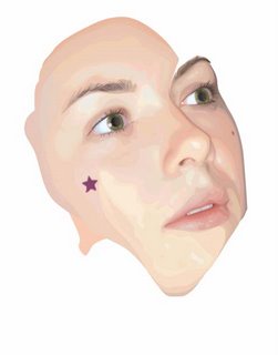
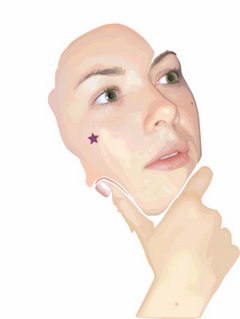
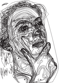
However, i had also envisioned a bit more animation regarding Mary and the lamb, such as PROPER walking into frame, and also more rollover efefects on them too. That I didnt achieve, because I knew it would involve a lot more time (sorry, have to use the 'T' word here) and effort, which i just didnt have, especially because I was pouring a lot of time and energy into the Illustrator face.
So I finished, it isnt exactly what I envisioned but I am still proud of myself for achieveing what I have. I am liking the ability to do interactive stuff like this, and I know that I definitely want to make and interactive portfolio in flash using the techniques I have learnt. And maybe some other interactive cartoon dabbling in the future - I should set myself a goal to make a character actually walk properly into frame! Maybe I will!


